Outline of a generic user-centered product development process
Products are developed to solve problems and user-research is undertaken to ensure the marketability of a proposed solution. The goal is to understand who the potential customers are, what they do, how they do it, how they feel about doing it, and how they relate to the tools and practices that help them do it. One size needn't fit all.
What follows is a highly generalized description of a user-centered product development process which places user-experience research (UX) and user-centered design (UCD) in their broader context. Your final project DOES NOT need all of these parts. People who do UX for a living don't typically participate in the whole process. Understanding the process, however, makes contributing to it more meaningful.
I've color coded and labeled the parts. The content in blue is business research. If the product already exists and your goal is to improve it, then these questions already have answers. The demographic research, in magenta, has likely also been done, but subsequent user-experience research may find it lacking. The content in rose is user-experience research, and the content in purple is user-centered design. User-centered design relies on usability testing to verify the implementation of UX research. UCD uses the data UX gathers.
While big companies might have different teams performing each of these parts, smaller companies or those that aren't into user-centered production might have a couple of people doing the rose and the purple or they might outsource either or both. People who write about UX research insist that it should be relevant from the start of product development but often lament that the UXers are only called in after the product fails to meet sales expectations.
UX's core information and data gathering techniques -- surveys, questionnaires, interviews, web analytics, remote observations, and in situ observations -- can be relevant at multiple points in a product development process. UX research might actually precede the business and demographic reserearch. The UCD efforts may lead to some UX re-research, though more often, I think, an already designed product fails to shine in usability testing and so the UX people are enlisted to figure out why. The process, in other words, is not as linear as this presentation makes it seem. And, I want to emphasize, UX and UCD often fall to a single person or team.
If for your final project you want to UX an existing product and suggest a re-design of it based on your research, you can take the blue part for granted and focus on the rose and the purple. You will still need to access or discover (or make up?) the magenta because you can't learn from people if you don't have any to study.
Business Research
- problem -- one that presents an opportunity
- hypothetical solution -- what if . . .
- preliminary analysis
- has it already been done -- environment scan for existing solutions (competitors)
- if not, why not
- cost, resources (money, time, people, opportunity costs), potential ROI
- hypothetical solution -- what if . . .
- proposed solution
- goals -- X will do A, B, C
- constraints -- money, time, equipment, will, available technology, personnel
- evaluation of success -- how will you know if you have a winner before you spend money and time on a loser?
- requirements (functionality) -- what it must do in order to reach the goal, ultimately expressed as a flow chart
- specifications -- at what price point, under what conditions, operating systems, languages, etc.
- research timeline -- what do you need to know, how will you find out, and in what order should your knowledge acquisition and data collection happen
(often a Gantt chart or several)
Gantt Chart
January February MarchQuestionnaireInterviewsObservations - milestones -- how you gauge progress towards completion taking multiple moving parts into account, often represented visually as a stoplight graphic.
Stoplight
stalled -- needs resources problematic -- needs attention on time & on budget -- keep going
Demographic Research
- intended population -- the people you want to help (sell)
- representative sample -- the people you hope to learn from
- contacts
- current clients
- employees and their friends acquaintances
- competitors' clients
User-Experience Research (UX)
The UX deliverables are task flows, user flows, scenarios, storyboards, empathy maps, and personas. These are used to represent and dramatize data obtained from questionnaires, interviews, and observations. UXers create these artifacts to help everyone focus on customers rather than products. UX isn't about selecting features; it's about understanding human needs and behaviors in order to provide solutions to real (or at least perceived) problems. Those solutions become the features.
- task flows -- a step by step flow chart : first . . . then . . . end
- If the product doesn't yet exist, then task flows are best discovered by observing people do the job you want to help them do, as opposed to having someone who has never done it imagine how it ought to be done. To develop a real task flow, you might use task observation (remote or in situ) with think aloud protocols and follow-up interviews. You can't rely solely on user-reports because if you ask someone to list the steps in their process, they often leave steps out or get flustered because much of what they do is based on tacit knowledge, unnoticed moves, and skewed mental models (they think they are doing X but actually its Y).
If the product already exists, then what you are observing is the user trying to use the product to accomplish their goals and so you are trying to discover how well the product's assumptions about how a user works matches both how they actually work and how they understand that work (the mental models).
- If the product doesn't yet exist, then task flows are best discovered by observing people do the job you want to help them do, as opposed to having someone who has never done it imagine how it ought to be done. To develop a real task flow, you might use task observation (remote or in situ) with think aloud protocols and follow-up interviews. You can't rely solely on user-reports because if you ask someone to list the steps in their process, they often leave steps out or get flustered because much of what they do is based on tacit knowledge, unnoticed moves, and skewed mental models (they think they are doing X but actually its Y).
- user flows -- the steps actual people (or personas) take to do what a task flow idealizes.
Example

Task flows, user flows, & journey maps: 3 tools worth their weight for alignment & UX design prioritization I haven't included "journey maps" because they are primarily associated with sales processes, putting items in "shopping baskets" and "checking out", essentialy.The same task flow might be performed differently by different users and so each task flow might have multiple user flows. The difficulty is in accommodating different types of people wanting to accomplish the same goal in different ways or in getting different people to do the same thing in the same way without creating such complexity that everyone is frustrated or being so rigid that reasonable creativity is stiffled.
- scenarios -- narrativized user flows
- The user starts here, then they go here, then here or there depending ..., and then . . . Tada!
Scenarios can be helpful because they can dramatize how different contexts might lead to different challenges and different needs. While users of Type A can take a stright line, Type Bs may need to make a couple side trips along the way. For a more sophisticated explanation, see Scenario Mapping: Design Ideation Using Personas
- The user starts here, then they go here, then here or there depending ..., and then . . . Tada!
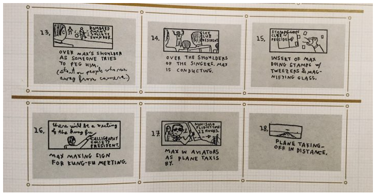
- storyboards -- a frame by frame visual representation of a persona behaving to type in a scenario (external POV)
- the user wants to . . . so they . . . then they . . . goal achieved
You could share video of a customer using a product. But if you don't have that, or can't edit it to make a compelling story, you can create a graphical drmataization that will tell the story while placing the viewers closer to the real scene. - empathy maps -- interior monologue of persona experiencing scenario (internal POV)
- at the beginning I . . . I'm not sure but I think . . . wait, what? oh! bingo!
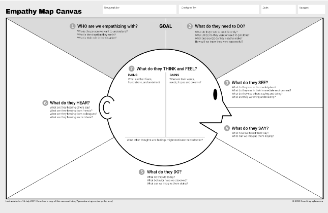
These can be generated by think aloud protocols, screen recording software, or in situ observation and interviews. They are like walking in a customer's shoes and seeing the world as they see it. - at the beginning I . . . I'm not sure but I think . . . wait, what? oh! bingo!
Scenarios, storyboards, and empathy maps are all ways of dramatizing customers' lived experiences so developers can see beyond their own point of view, to think outside themselves and so better serve their intended clients.
- scenarios -- narrativized user flows
- personas -- your intended market's segments personified. It is a primary principle of UX that not all users are the same and therefore products need to accommodate differences and be designed with those differences in mind. Different personas generate (and rationalize) different user flows.
Example
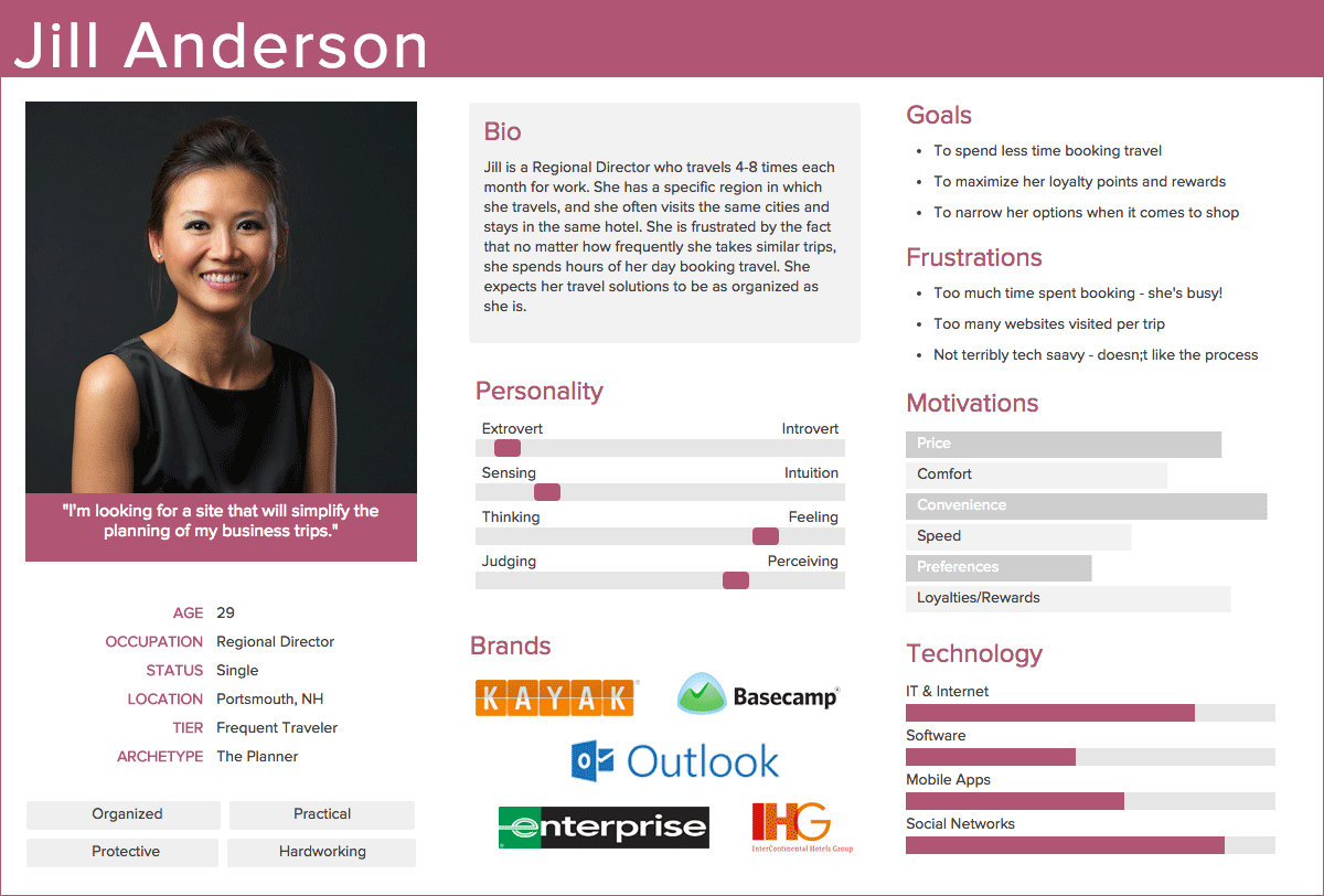
The data gathered to develop personas tends to fall along the following lines, but you will find a more thorough explanation under Lectures, Week 6.- needs
- motivations
- behaviors
- related experiences
- frustrations
- technologies
- psychographics
- demographics
- information consumption, sources and patterns embodied
User-Centered Design (UCD)
User-Centered Design deliverables are a sequence of visual, eventually dynamic, representations of what the final product will look and feel like based on the UX research and subsequent usability testing. Each of these artifacts also provides a site for capturing more user-experience data. The terms "wireframe" and "mockup" (both hi and low fidelity mockup) are sometimes used interchangeably, but the basic idea is to move from a sketch (simple, fast, cheap) to an image (colorful, attractive but static) to a functioning prototype (looks, feels, and works like the final will). Each stage lets you gather data on which to build the next stage. There are many websites/software services to help you move from the back-of-a-napkin sketch to a fully functioning prototype and some AI tools that promise to take a sketch to completion with a click of a button.
Have a look at RelumeLibrary. It uses AI to generate a wireframe which it can then export to Figma or as text.
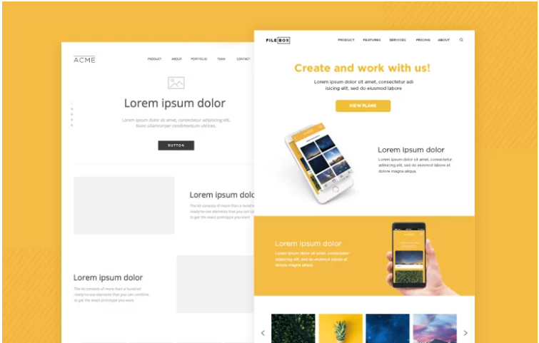
- wireframe -- rough sketch, boxes and arrows, line drawings
- user testing
Example
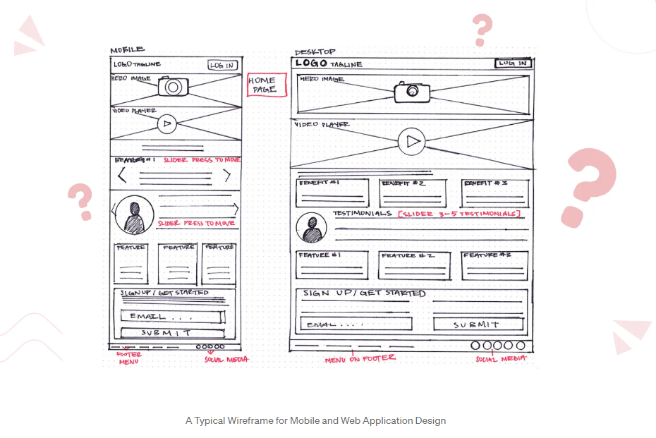
"Wireframing in UI/UX Design What, Why, and How about using Wireframes". UI stands for User Interface Design, see below
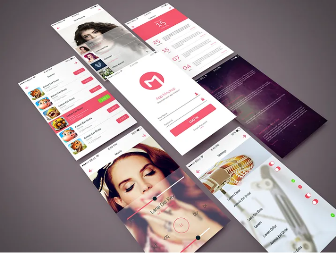
. - mockup -- images with non-functional buttons and dials or other navigation tools that let a person visualize the product
- user testing
- prototype (high-fidelity mockup) -- functioning version of the previous mockup that lets a person interact with the product
- user testing
- beta -- fully functioning product that lets a person do with it what it was designed to do (and find flaws)
- user testing
Ship It
Start gathering new data for version 2.0 (or 1.2).
User-Interface Design (UID)
You may have noticed the expression User-Interface Design (UID). It is sometimes paired with UX, as in UX/UI. User-Interface Design is a specific application of UX and UCD and Usability. It's the process of creating easy to use, intuitive, digital surfaces (interfaces). As Usability.gov explains, "UI brings together concepts from interaction design, visual design, and information architecture." (link)
The concept at the core of all of these acronyms (UX, UID, UCD, as well as Usability) is the same, the way a given people understand and intend to use an object should inform how the object is designed and consturcted and delivered. I.E., Rhetoric.

