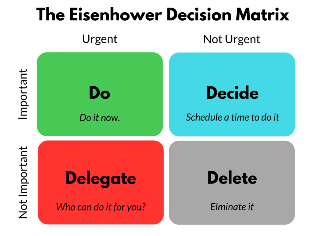
2 X 2 Decision Matrix
This is a common technique for visualizing the relative promise of competing ideas. At either end of each axis are opposite terms. In this example, you are trying to decide what features to add to product by comparing cost and impact. The low hanging fruit would be anything you could put in the bottom left quadrant. Anything top right would be wasting money. Top left would luxuries. Bottom right would be a meh but maybe. The most famous example of this technique is the Eisenhower Decision Martix. 
Instructions
Click in a quadrant and you can enter text. To place it, you need to use the space bar and the enter key. Not ideal. Post-it Notes or a white board would be easier to use. But if you want to, you can download this file to your computer and edit the HTML and CSS to suit your needs. MS's Copilot wrote most of this. I tinkered with it a bit. If you need to UX remotely, miro might be the way to go.